Shopify Homepage Sliders That Tell a Story
A shopify homepage slider that tells a story: announcement bar, hero, collections, bestsellers, Instagram tiles and newsletter flow from a bridal store.
 Selim Abdulsalam September 2026 6 MIN READ
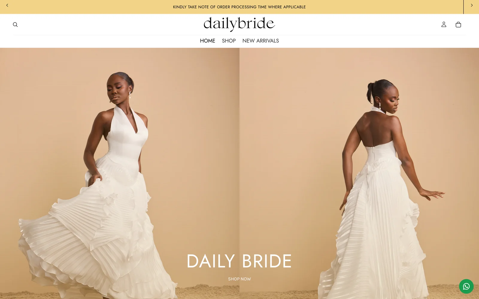
A shopify homepage slider that tells a story gives each slide one message and one next step, then hands the visit to collections, proof, and signup without repeating itself. On a fast bridal conversion build, the slider worked because it behaved like a host: greet, orient, and step aside. You will know yours works when shoppers scroll past it with purpose instead of waiting for it to entertain them.
The storefront in this story opens with a slim announcement bar that rotates short notes, then a hero offering SHOP NOW and NEW ARRIVALS over bridal campaign imagery. Below sit Celebrations and Special Occasions collections, a SHOP THE LOOK moment, DISCOVER OUR STORY, OUR BESTSELLERS, a BRIDAL COLLECTION block, Instagram tiles under the store handle, a newsletter signup, and a full footer signed Built by Oasis. The header pairs Search with a cart drawer trigger for quick returns. Nothing shouts. Everything points somewhere. That restraint is the craft.
Give the announcement bar and hero different jobs
The announcement bar welcomes and the hero directs, and mixing those jobs creates mush. Keep the bar to short, factual slides that can be read in a glance, such as new arrivals, bridal entry, and signup invitation, with no fine print that demands a pause. Give the hero one headline, one supporting line, and two contrasting actions at most, here SHOP NOW beside NEW ARRIVALS, so first-time and returning shoppers each see their door. Shopify describes per-market content control in its guide to market customizations, which is useful when wording or featured collections should differ by audience while the story arc stays intact.
Limit slide counts on both surfaces. Three announcement notes and two or three hero frames are plenty for a bridal catalog; more than that and shoppers stop reading and start tolerating. Each hero frame should be able to stand alone, with imagery, headline, and button agreeing on one destination. If a slide needs a paragraph to make sense, it is not a slide. It is a page asking for forgiveness.
Test the top of the page like a bouncer checks IDs: quickly and without sentiment. Can a new visitor say what the store sells, who it serves, and where to tap next within five seconds on a phone? If not, shorten words before you restyle anything.
Turn collections and proof into the middle of the story
After the greeting, the page should answer what goes with what and why this house deserves trust. Here Celebrations and Special Occasions collections carry the occasion logic, SHOP THE LOOK shows pairing instinct, DISCOVER OUR STORY gives the human background, OUR BESTSELLERS offers social proof, and the BRIDAL COLLECTION block opens the most considered path. Each block gets one headline, one supporting line, and one action, with honest collection names doing the heavy lifting. Shoppers follow this middle because it mirrors how they already decide: occasion first, pairing second, reassurance third.
Keep imagery honest across the sequence. The hero can dream a little, but collections should show what shoppers will actually find when they tap through. Match the first collection image to the landing grid so the visit feels continuous rather than staged. Then check the return path: from a collection back to home, from a product back to its collection, and from Search back to a sensible shelf. My bridal product pages for mobile guide picks up where this leaves off, keeping galleries, size help, and fabric answers tight once the slider has done its greeting.
You can see the same middle-story rhythm in my selected storefront work, where collection order, story placement, and proof blocks follow one consistent arc. The details differ by store. The courtesy does not.
Close with social and signup, not noise
Instagram tiles and the newsletter signup close the page by extending the relationship beyond one visit. The tiles show real-world texture under the store handle and give hesitant shoppers a low-pressure way to keep watching. The signup follows with a clear promise about what arrives and how often, plus a confirmation state that proves the action worked. Resist surrounding these blocks with extra banners, popups, or competing calls to action. The end of the page should feel like a friendly door, not a final sales pitch shouted down the hallway.
Connect the signup to your email aid and test it end to end: subscribe, confirm, receive, and unsubscribe paths should all behave with dignity. Keep internal notes vague about providers and lists, and keep shopper-facing copy focused on value rather than mechanics. A signup that works quietly will gather more names than a loud one that misfires once.
For the wider pre-announce picture, my new store launch checklist places this slider and signup work inside the full domain-to-announce order. Sliders shine brightest when everything they point to is already buyable.
Shopify homepage slider story checklist
Use this shopify homepage slider pass whenever a homepage feels busy but oddly unhelpful.
- Bar. Three short announcement notes at most, each readable in a glance, with no fine print or competing actions.
- Hero. Two or three frames, each with one headline, one supporting line, one destination, and honest imagery that matches the landing shelf.
- Middle. Collections, SHOP THE LOOK, story, bestsellers, and bridal entry in occasion order, each with one headline and one action.
- Close. Instagram tiles plus newsletter signup with a clear promise and a working confirmation, followed by a complete footer.
- Motion. Timing that respects readers, pause on interaction, and no auto-advance so fast that buttons become moving targets.
- Proof. Five-second phone test for what, who, and where-next, plus Search, collection, product, and cart return paths.
Do sliders hurt conversions?
Undisciplined sliders can, because competing messages, tiny buttons, and fast rotation punish the exact shoppers you want to keep. A restrained slider with few frames, one message each, and honest destinations behaves differently: it orients quickly and yields the floor to collections and proof. Watch behavior rather than debating taste. When visitors pause on the hero, tap through to a collection, and continue to a product, the slider is helping. When they bounce from the top without scrolling, shorten and clarify before you add another frame.
Should I use video in the hero?
Only when it clarifies faster than a still image and loads gracefully on mobile data. Bridal motion can be lovely, but a heavy hero that delays the first meaningful view will cost more visits than it charms. When you try motion, keep it short, silent by default, respectful of motion preferences, and paired with a still fallback that carries the same message. Measure the change in scroll depth and product taps rather than admiring it yourself. Your affection for a clip is not a metric.
If your homepage needs a calmer story arc, get in touch with your current slide count and the three pages shoppers visit most, and we will shape it together.